Predicting NY's Early COVID-19 Mortality Rate with Pneumonia Deaths
a linear regression analysis of april pneumonia deaths in order to estimate new york's early covid-19 mortality rate.
Introduction
In recent months, we’ve seen the devastating toll that COVID-19 has taken on the United States, especially in the state of New York. As of Sunday, New York has experienced the loss of over 16,000 residents, with more deaths expected in the coming days and weeks even as hospitalizations decline. However, experts have become increasingly skeptical over whether these numbers accurately track the true death toll caused by COVID-19. As a New York Times article discusses, there are significant “deviations from normal patterns of death” (1) worldwide, largely due to a lack of testing. Since not every dead body can be tested for COVID-19 due to shortages, many deaths may have gone uncounted in the official death toll. For example, COVID-19 has been shown to induce pneumonia among other potential illnesses. While pneumonia and its death rate are both accurately tracked throughout the United States, not all of those deaths may have been tested for COVID-19. Thus, it is possible that we can develop a better understanding of the true mortality rate of COVID-19 by analyzing the weekly death rate of pneumonia during previous years and using this knowledge to estimate the number of pneumonia deaths that may have been caused by COVID-19 during the month of April.
The importance of this question lies in the fact that, due to significant testing shortages, the mortality rate of COVID-19 has been a more informative metric for its spread than other typical metrics that have been used in the past. As a recent article in the journal Nature discusses, the daily and weekly death counts can help communities accurately track the progression of the virus as well as test the effectiveness of their containment measures (2). With an accurate mortality rate, communities can make better decisions regarding when it is time to reopen businesses and relax self-isolation measures, as well as when these measures need to be tightened again to stop the spread. Since the mortality rate is currently the best tracking option we have, its accuracy has become even more important for COVID-19.
Data Description
For this paper, we will be using the flu testing data from the State of New York from the past four years (including the current season), as well as the weekly death count for influenza and pneumonia for the State of New York (although the initial dataset contained all states). This data is trustworthy for our purposes as it was sourced by the CDC, which collects information directly from the states. In regards to the death count data, the deaths caused by pneumonia or influenza do not overlap; however, there is no certainty that all deaths caused by pneumonia or influenza are directly attributable to the flu. Additionally, the tracked deaths include cases in which pneumonia/influenza are listed as one of the causes of death, but this does not guarantee that it was the primary one, nor does it exclude COVID-19 deaths in the current season (4). Nonetheless, this data can still help us answer our research question as we are looking for the typical number of pneumonia deaths in a given flu season. We don’t necessarily need to know whether these were directly linked to the flu; as long as there is an accurate count of typical flu season deaths due to pneumonia, then we can confidently estimate the normal amount of deaths we would be experiencing this past month had COVID-19 not occurred.
In regards to the testing data, it is important to realize that the 2017-18 flu season was notably worse (3) than other years. As demonstrated later in this paper, this has a profound impact on the way in which we analyze the data, as not taking this into consideration could underestimate our end resulting death count for COVID-19. However, the 2016-17, 2018-19, and 2019-20 seasons all faced relatively similar strains of influenza, so the seasons of 2016-17 and 2018-19 will be especially helpful in our analysis as they are most similar to the current season.
Exploratory Data Analysis
We start with the collection of raw features from each data source. Not all of the collected features were useful for our particular analysis. The “season” and “number of pneumonia deaths” were used as raw features in our analysis. As for derived features, we calculated the following: first, an “adjusted week” which started the timeline of a season at the 40th week of the first year and ended the season at the 39th week of the following year, using the “week” feature from the data. The other derived feature was a “positive cases” metric which was the absolute value of “total specimens” (total tests conducted scanning for the flu) multiplied by “percent positive”; this gave us the total number of patients that tested positive for a strain of the flu in a given week.
Using these features, we decided on using “adjusted week” as a predictor variable for our SLR, Polynomial Regression, and MLR models, while we subsetted the data according to the season. For both our polynomial regression and MLR models, “adjusted week” and its value to polynomial powers up to 5 are used as predictor variables. We also used “positive cases” as a second predictor variable for our MLR model. Finally, the “number of pneumonia deaths” served as our response variable across all models. In the data used for analysis, we didn’t find any particularly unusual patterns. While we did find that a multicollinearity between “positive cases” and “adjusted week” exists, it wasn’t entirely unexpected due to the cyclical nature of the flu.
Data Analysis
As previously mentioned, in this analysis we chose to look at three particular models: an SLR, Polynomial Regression, and MLR model. For all of these cases, we chose to map on the x-axis the “adjusted week” predictor variable, and the “number of pneumonia deaths” response variable on the y-axis. We start with both SLR and Polynomial Regression, as our Polynomial Regression model will simply build upon our SLR model. It made sense to test these models out first in order to see whether the general trend of the pneumonia death count over time could be captured by just the current week of the flu season. However, the need for more than just the “adjusted week” variable is quite clear from the graphs below (as well as looking at the Adjusted R-Squared for each curve), because even if we can capture the “general trend” of deaths through just the timeline, we cannot capture the proportion of how severe the season will be from just the timeline: for that, we will need the flu testing data.
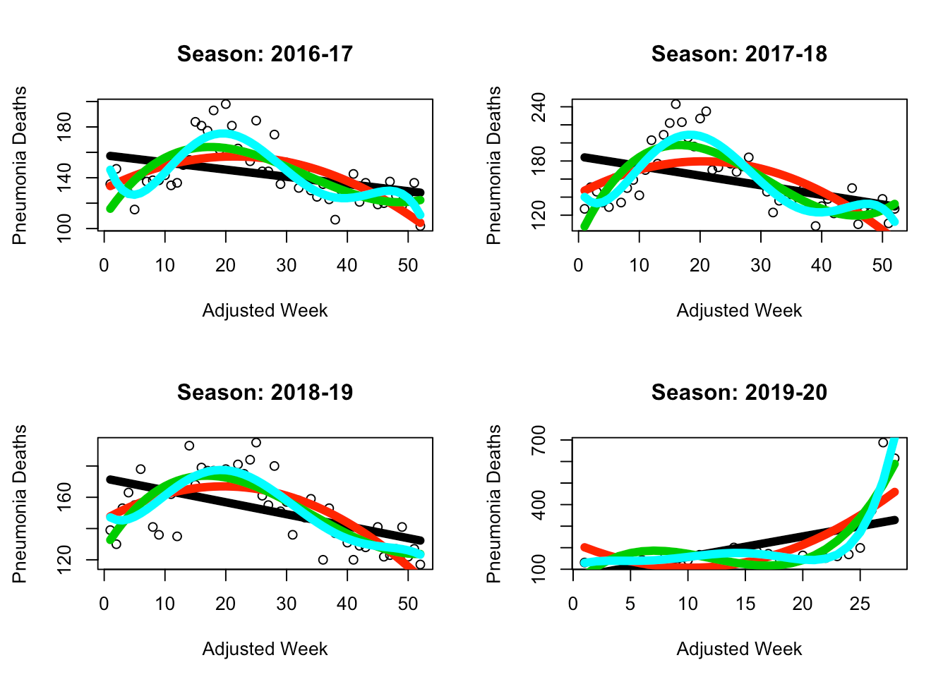 The black line is SLR, the red line is Polynomial Regression (d=2), the green line is PR (d=3), and the light turquoise line is PR (d=5). While the SLR model does not seem to be able to capture the general parabolic trend of the data, it appears that the PR (d=5) model is able to provide an accurate fit without overfitting the data. Thus, in the following MLR model we have chosen to use PR (d=5) for the “adjusted week” predictor variable. This way we are able to maintain our current capture of the general trend while also introducing a variable (“positive cases”) which will provide context on the scale of that trend (for example, during the peak of the trend, this helps us understand how high or low should the absolute number of deaths will be).
In the MLR case, we add “positive cases” and find the following:
The black line is SLR, the red line is Polynomial Regression (d=2), the green line is PR (d=3), and the light turquoise line is PR (d=5). While the SLR model does not seem to be able to capture the general parabolic trend of the data, it appears that the PR (d=5) model is able to provide an accurate fit without overfitting the data. Thus, in the following MLR model we have chosen to use PR (d=5) for the “adjusted week” predictor variable. This way we are able to maintain our current capture of the general trend while also introducing a variable (“positive cases”) which will provide context on the scale of that trend (for example, during the peak of the trend, this helps us understand how high or low should the absolute number of deaths will be).
In the MLR case, we add “positive cases” and find the following:
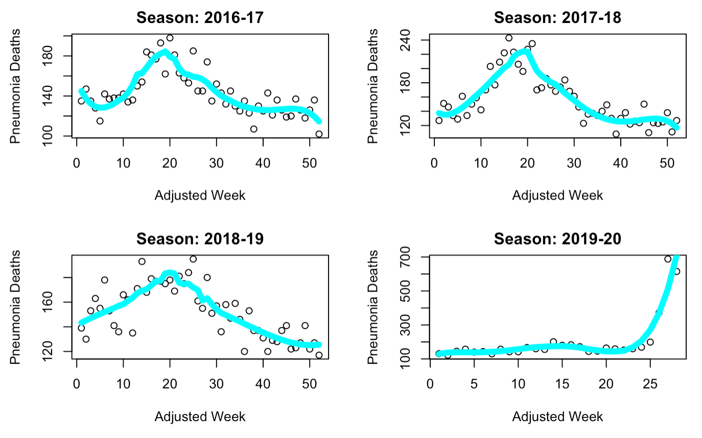 Here we can see that the general trend of the data is still captured, although the curve is slightly sharper towards the peak and has lost some of its parabolic behavior. Regardless, this model visually seems to best fit our data. A look at the Adjusted R-Squared values for each curve confirms this intuition (2016-17: 0.7227, 2017-18: 0.8043, 2018-19: 0.6757). As for our assumptions, we can first analyze whether it is fair to suggest that the underlying data comes from a Gaussian distribution. While the data as plotted above looks parabolic, this doesn’t immediately confirm that the underlying distribution of data is Gaussian. However, we will be assuming that the data is normally distributed - this is because it makes intuitive sense for the most deaths to occur towards the middle “peak” of the season and less to occur at the start and end of the season. We also assume that this data is indeed linear, and as such can be used with linear regression. We will now analyze both these assumptions below through diagnostic plots.
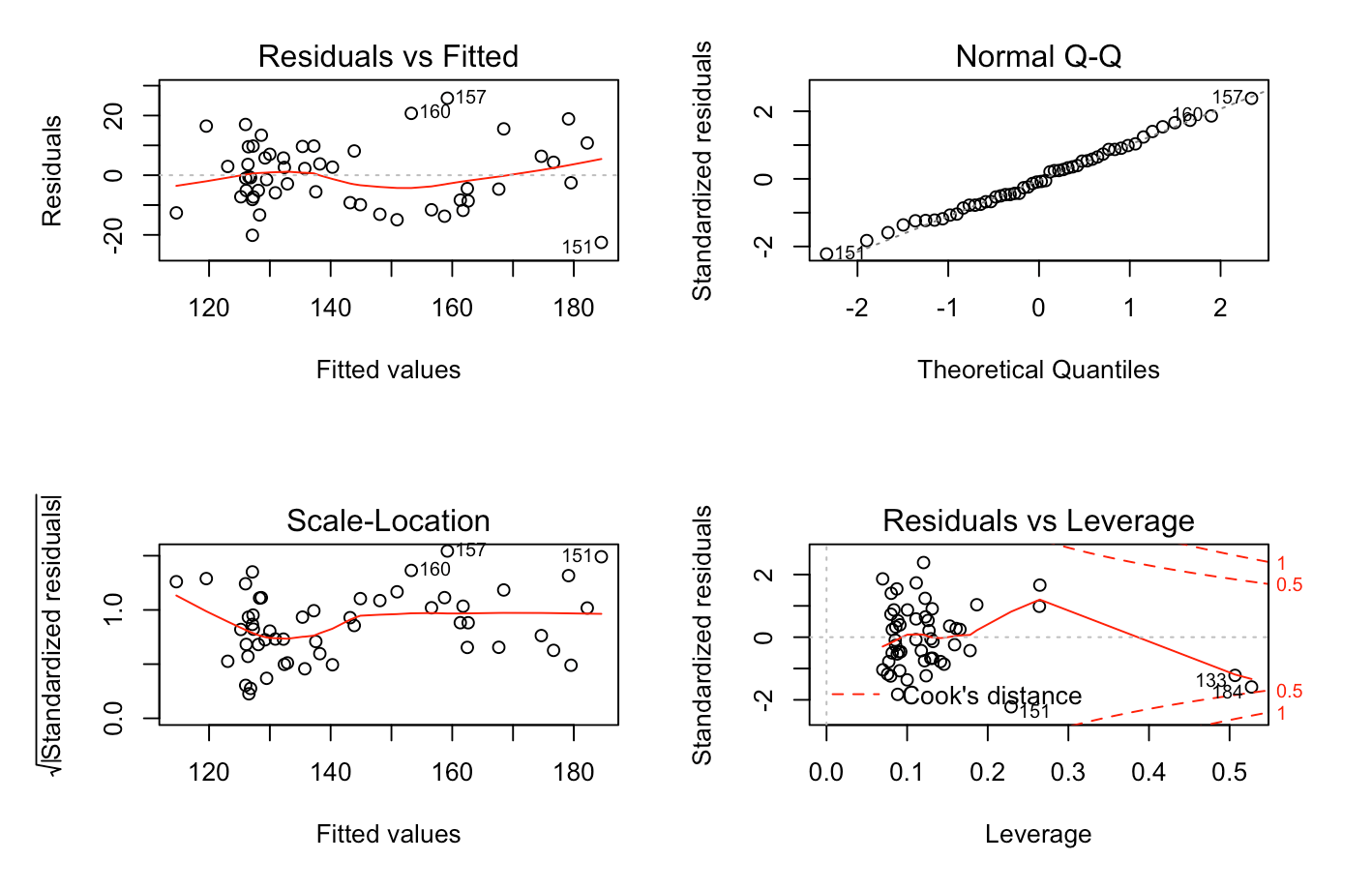
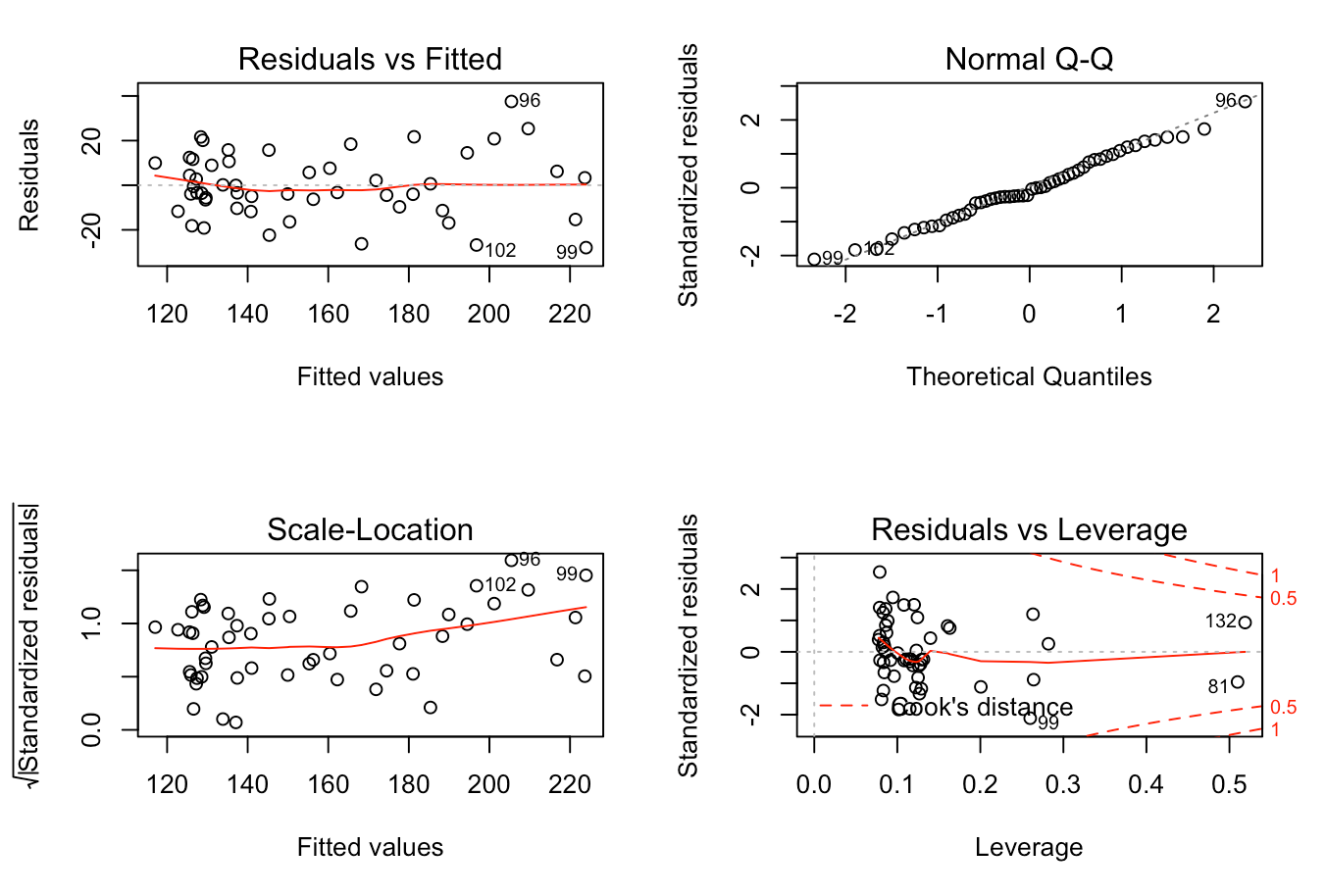
Most of the diagnostics for the models corresponding to each season were relatively similar. Starting with the common “residuals vs. fitted” diagnostic, we find that the models for 2017-18 and 2018-19 have an approximate horizontal line at the zero, as well as scattered values of equivalent variances, indicating that the data should indeed be linear. However, the 2016-17 model shows some clustering on the left-hand side, thus rendering the model more unreliable than the others. Perhaps just as importantly, we were able to confirm our Gaussian assumption through the QQ-plots, all of which formed a linear diagonal line, indicating a likely normal distribution. The diagnostic plots of “scale and location” and “residuals vs. leverage” were also looked at. These showed that for the 2017-18 and 2018-19 models, we appear to have equal variances throughout, as well as few outliers, but no points seem to be exerting outsized influence on all three models as the points are within Cook’s distance.
2016-17
2017-18
2018-19
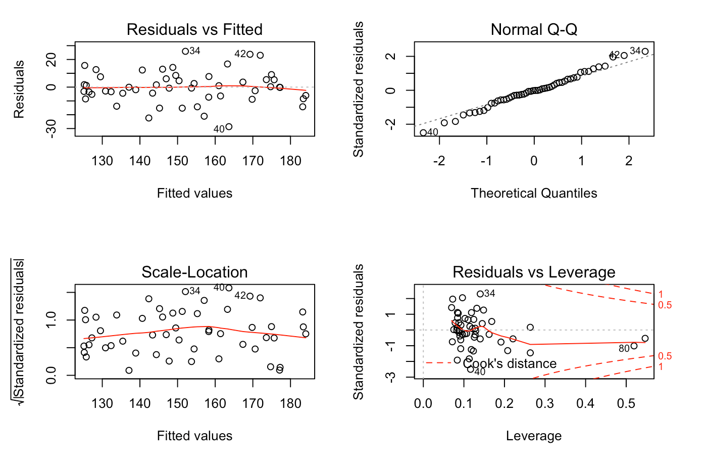
From this analysis, it seems clear that the two models most suitable for use in our research question seem to be the 2017-18 and 2018-19 models, as the 2016-17 model may suffer from non-linearity, as well as a lack of equal variance.
Summary and Discussion
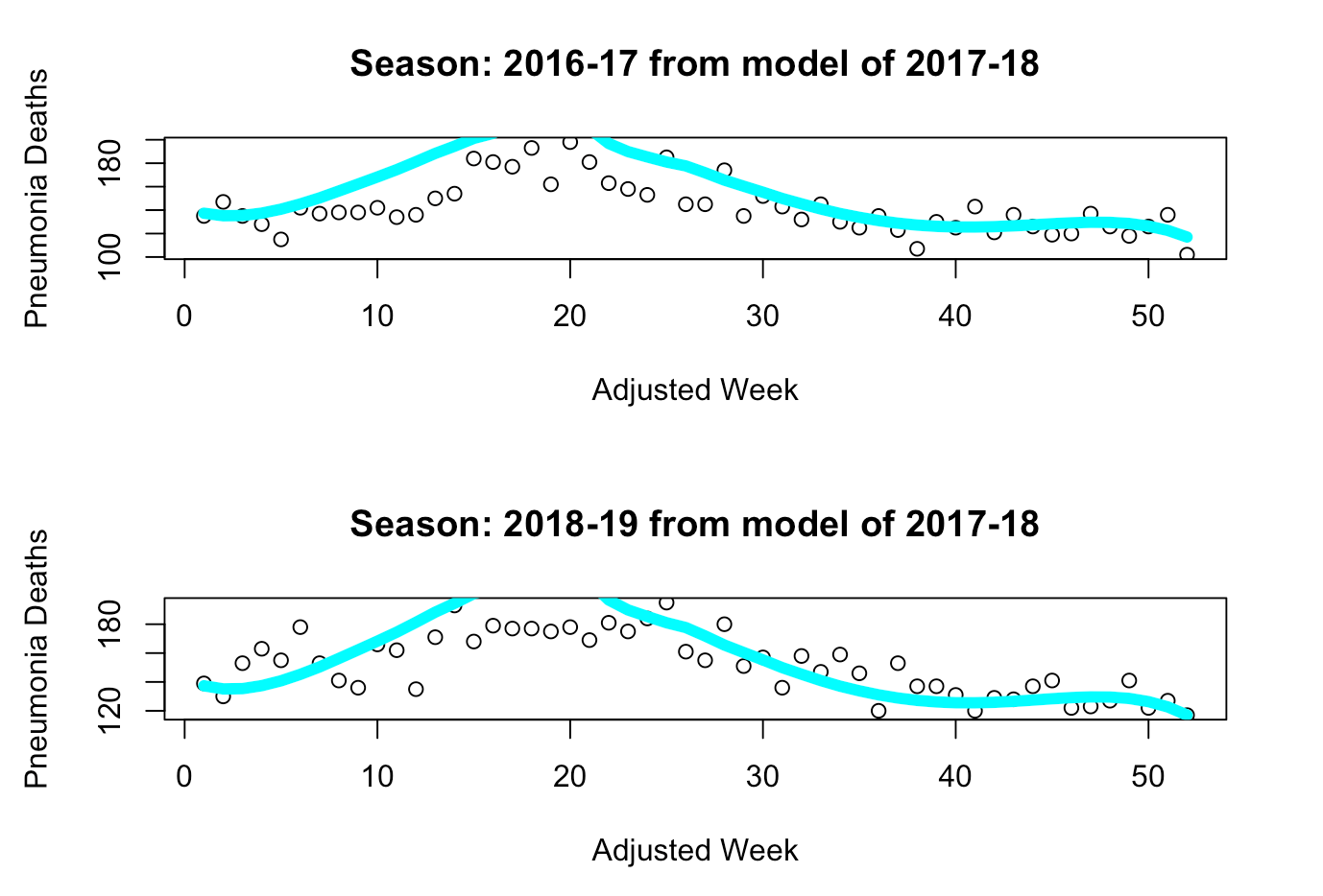
Now that we’ve gone through the model selection phase and verified our two core assumptions for both of these models, we will now use these models to analyze COVID-19's impact on pneumonia deaths in the 2019-20 season. First, we can see that each selected model captures a different “scale” of death during a flu season - the 2017-18 model captures a deadly year, whereas the 2018-19 model captures a normal year, as we can see below.
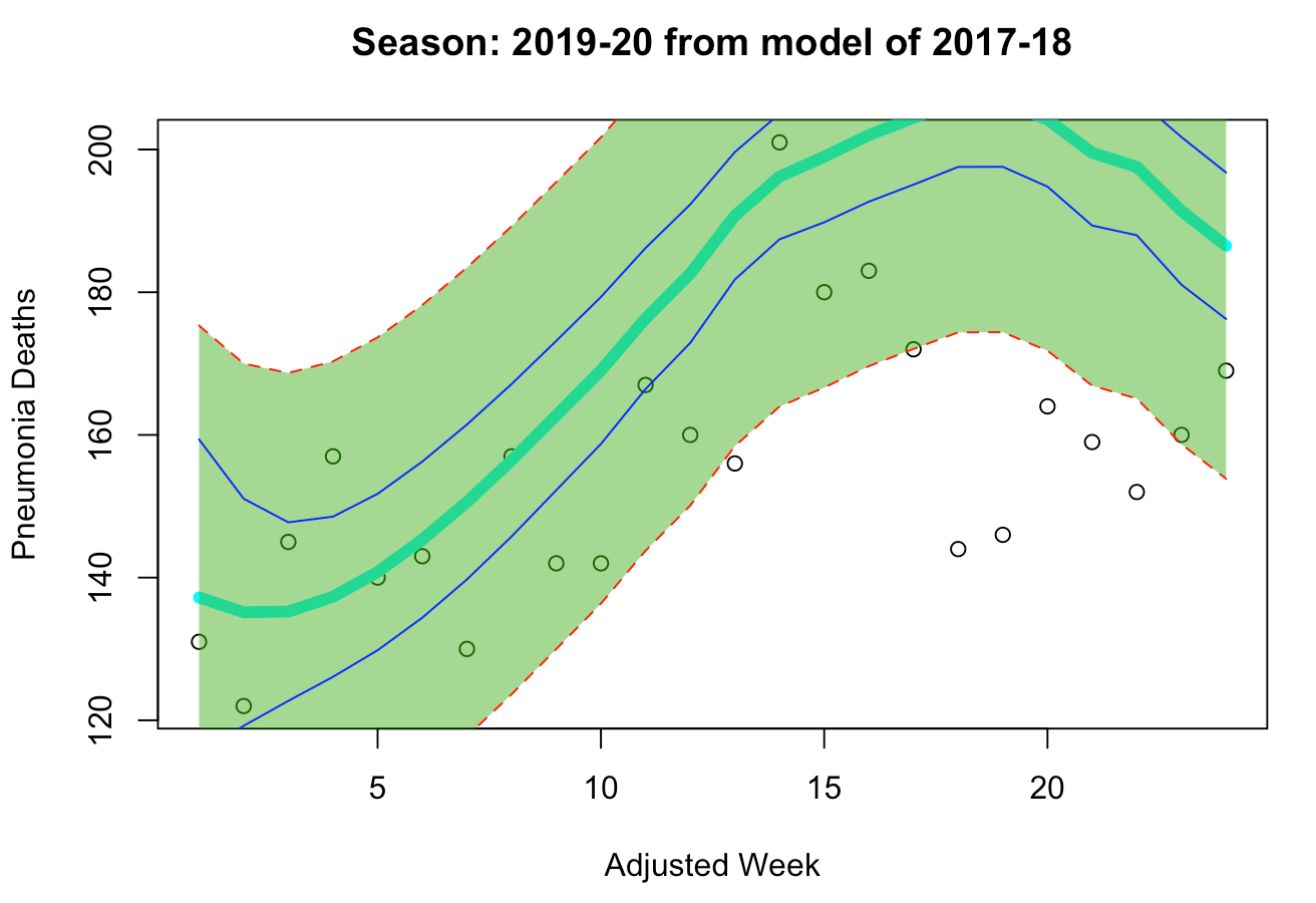
“Deadlier” Model: 2017-18
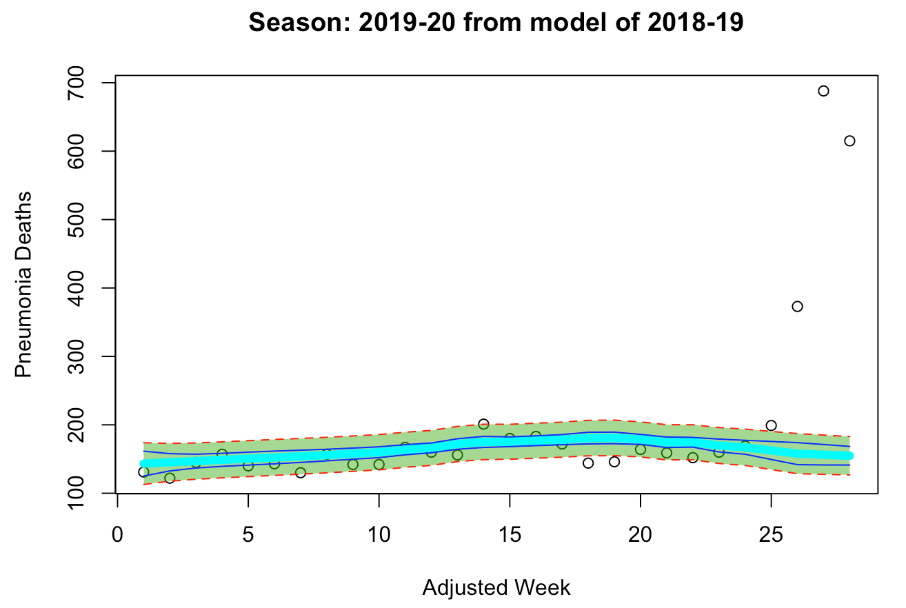
“Milder” Model: 2018-19
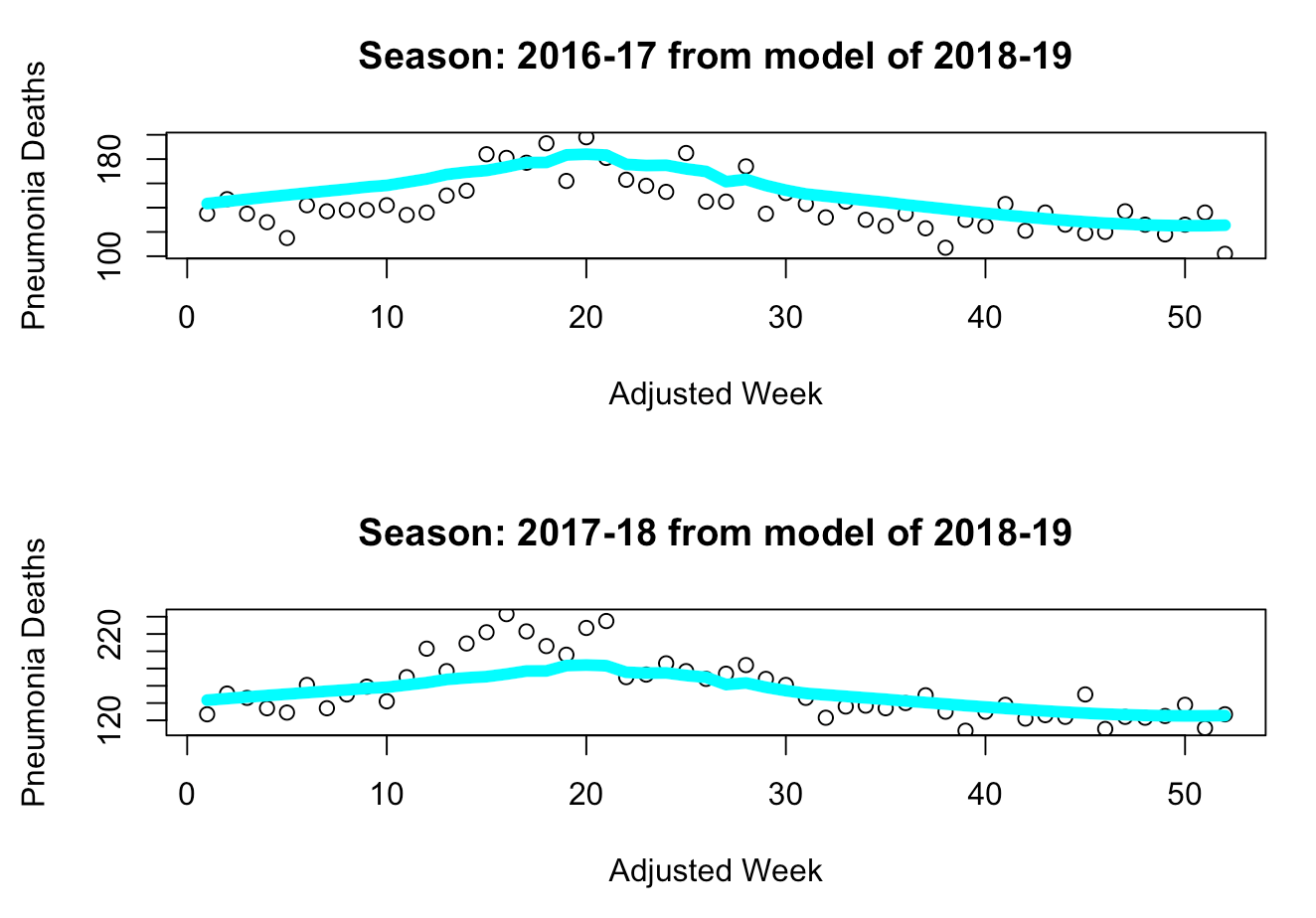
We can see from these charts that the 2017-18 model seems to overestimate the number of deaths in a milder year, whereas the 2018-19 model seems to underestimate the number of deaths in a deadlier year while accurately capturing the trends of a milder year (such as 2016-17). Thus, we can use each model on the current data of the 2019-20 season to first determine whether the season is “deadlier” or “milder”. Once we’ve made that determination, we can use the final model to estimate the weekly deaths that should have occurred during this flu season without COVID-19, and then take the difference between the actual number of deaths from pneumonia and our estimates.
From the models below, we can see how the “deadlier” model provides us with a wider prediction interval than the “milder” model. Upon analyzing both models, we can clearly see that the “milder” model seems more suitable for our problem, as its fitted line is more closely aligned with the existing data points of the 2019-20 season. Additionally, even though the “milder” model’s prediction interval is narrower than that of the “deadlier” model, it still manages to capture all but two data points prior to week 25. Meanwhile, the “deadlier” model seems to significantly overproject the deaths during week 17-22, with the prediction interval of the curve missing all of the actual data points. Additionally, the peak of flu season usually occurs between weeks 15-25. Thus, since the “deadlier” model could not capture data points around the season’s peak, it is likely not as suitable for the 2019-20 season as the “milder” model is. This is further indicated by the closeup view where the data points beyond the 24th week of the 2019-20 season are hidden from visibility. The better fit of the “milder” model can be interpreted as an indication that the 2019-20 flu season is more of a normal, mild season similar to the 2016-17 and 2018-19 seasons rather than a deadly season as the 2017-18 season was.
“Deadlier” Model: 2017-18
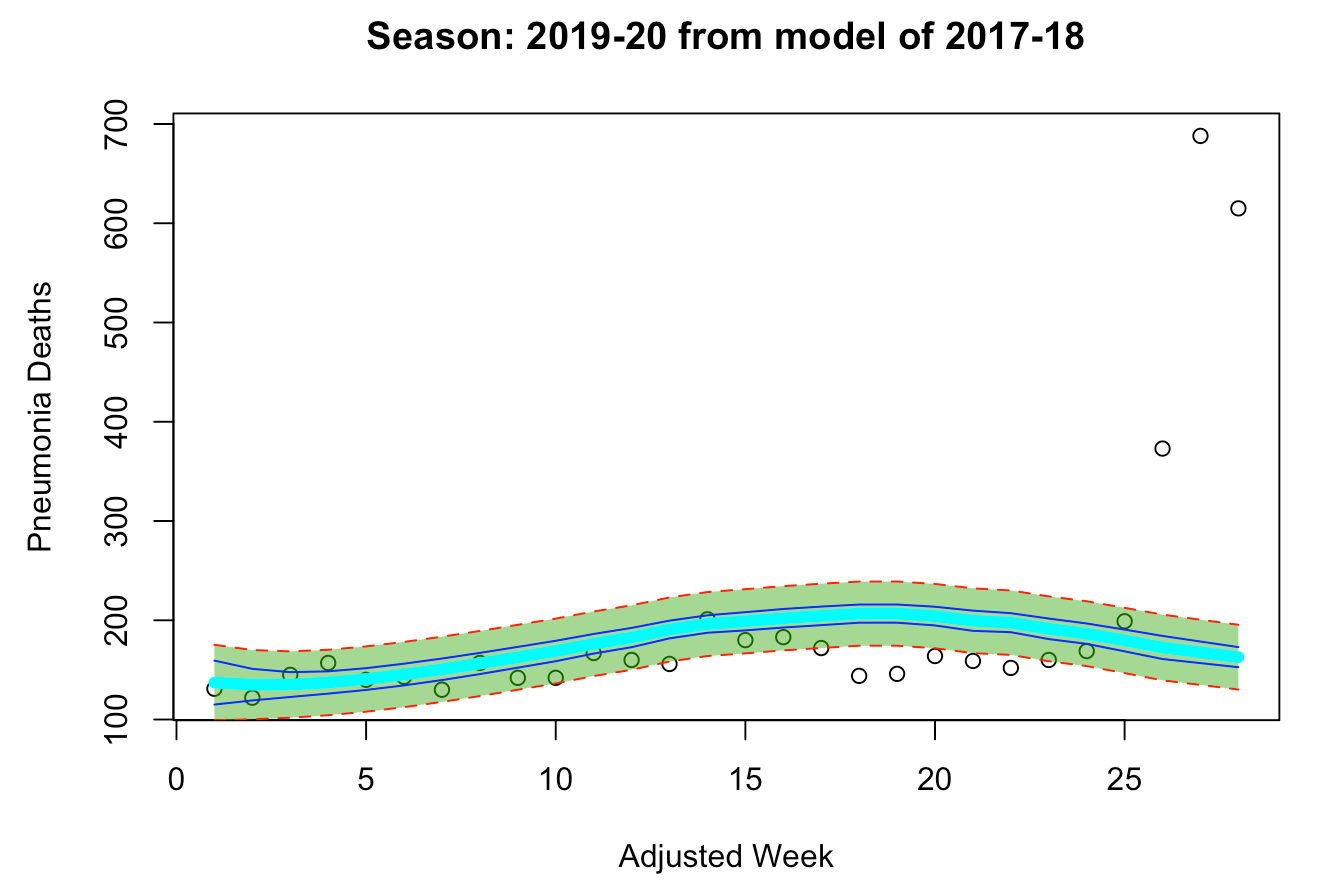
“Normal” Model: 2018-19
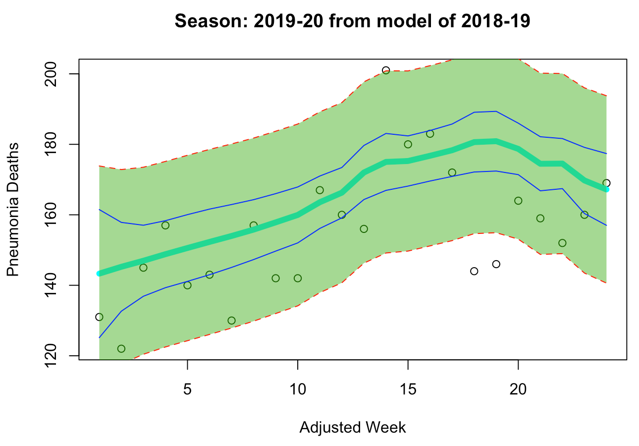
Since we’ve determined that the “milder” 2018-19 model can better fit the current season, we can now explore the impact of COVID-19 on the number of pneumonia deaths this year.
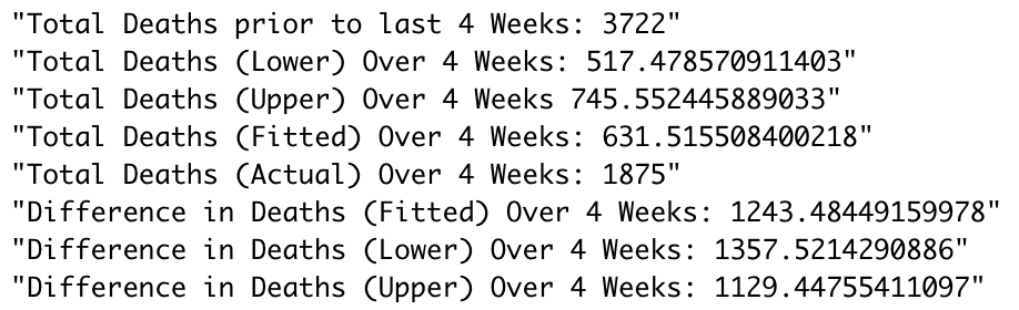 As we can see from all of these estimates, a significant portion of the population has died of pneumonia due to COVID-19, with our model estimating that between 1,130 and 1,357 of those who died of pneumonia may have also been affected by COVID-19. It is important to realize, however, that this doesn’t necessarily indicate these people all died from COVID-19. Not only is this just an estimate, but it also could indicate that people died from pneumonia as a result of different living conditions due to COVID-19 affecting their environment, even if they did not have COVID-19 themselves. Nonetheless, this estimation shows that the mortality rate of COVID-19 may be much higher than we currently believe.
In order to truly test that question, however, we would need more specific data which would tell us how many people died from pneumonia without COVID-19 also on their death certificate, so that we could eliminate the overlapping data that our analysis currently has. As for other limitations, this analysis could benefit from tools used in practice that are outside the scope of this course, such as time series forecasting. Rather than having to select a model that only uses a subset of the data we have available (that is, a season’s worth), future research could use all the previous data points in a continuous time series to forecast the current season. Future analysis could also employ the use of additive models, in that the curve fitted to each season would be treated as a function and aggregated together. Similarly, an aggregated regression could be obtained by removing the “season” feature and regressing over all the data points even though multiple y-values exist for each x-value (“adjusted week”).
Conclusion
In summary, we’ve found that COVID-19 has had a significant impact on the number of pneumonia deaths for the month of April in New York State, and we now have a bounded estimate on that number which lies above 1000 individuals. This brings us one step closer to understanding the true mortality rate of COVID-19, which will in turn help experts better track the virus and its progression in the state.